
PipelineRx / PowerGridRx–Combined Patient View
The What
PowerGridRx is an application developed by PipelineRx that enables tele-pharmacists to process medication orders from hospitals, for patients.
The goal for this project was to improve the efficiency of the workflow while also updating the branding.
The Why
The problems that pharmacists were experiencing in the existing app, primarily, were slow performance and an inefficient and undesirable user experience do to the lack of user input.
The main pages of the workflow consisted of the medication orders queue and the patient page. Because of this, the users were constantly going back and forth between the orders queue and the patient pages. If the users were covering 8-10 hospitals in a shift, the orders queue would contain hundreds of medications orders which impacted how long it would take to for the orders queue to load.
In an 8 hour shift, the amount of time wasted going back and forth between the orders queue and the patient view directly impacted the time it took for patients to get their meds. It also increased costs of staffing the pharmacists.
Project Specs
Tools
Adobe XD
Team
1 product designer
2 developers
1 product manager
My Role
Lead Product Designer
UX Researcher
User Testing Moderator
Timeline
Overall: 9 months
Discovery & Research: 1 Month
Design & VQA: 10 weeks
Design Goals
Drive to a single location
Tele-pharmacists should be able to process medications in one application.
Utilize a consistent interaction model
App should utilize familiar components and interaction models, making training for Tele-pharmacists easier.
Enable easy navigation between patients
Tele-pharmacists should be able to easily navigate between patients, making their workflow much more efficient.
Modernize the app
Build the app on a more modern tech stack and apply updated branding.
Discovery & User Research
User Observations & Interviews
Before even thinking about the design, I had to first understand the pain points that pharmacists were experiencing during their shifts. To accomplish this, myself, the Product Manager and Clinical UX Specialist did a series of user observations and user interviews.
Pain Points Identified
The existing user flow was very inefficient.
Pharmacists spent a lot of time going back and forth between the orders queue and individual med orders.
Visual hierarchy was lacking, making it difficult for users to identify key data points for each medication order.
Application performance was very slow.
Patient Information was disorganized making it difficult for users to find key information about the patient.
Before: Below are some screen shots of how the app looked when we started the project.
Beginning the ideation process

Starting with sketches
As I typically do with most of my projects, I always start with sketches. I love this method because I can quickly get loose ideas on paper which I then reference later for lo-fi wireframes.
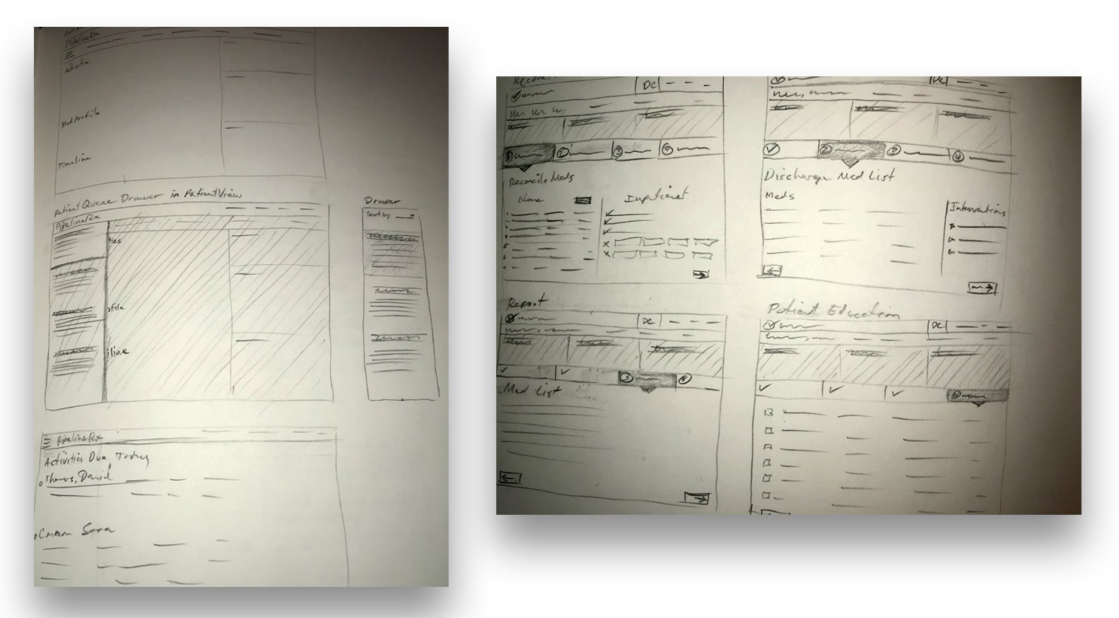
Wireframes
Early concept before we applied the new branding

Refinements & Branding

Patient Drawer and Patient Panel

Medications Tabs & Patient Timeline

Prepare Med Card Workflow

Patient Drawer and Patient Timeline Details

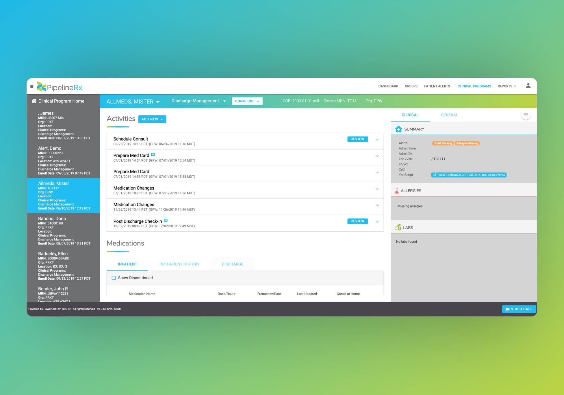
Putting it all together
After
The user experience has a much more cohesive and elegant look & feel.
The users no longer have to go back and forth between the patient pages and the med orders queue to perform their tasks, which greatly reduced the time it takes to process patient medications.
Results
During this whole process, we regularly engaged a group of pharmacists to make sure we were aligned on all of the design decisions we were making. As a result, they were elated with this new design and it drastically improved their ability to take care of patient’s needs.
Changes are projected to save PipelineRx $1.3M/year.
